
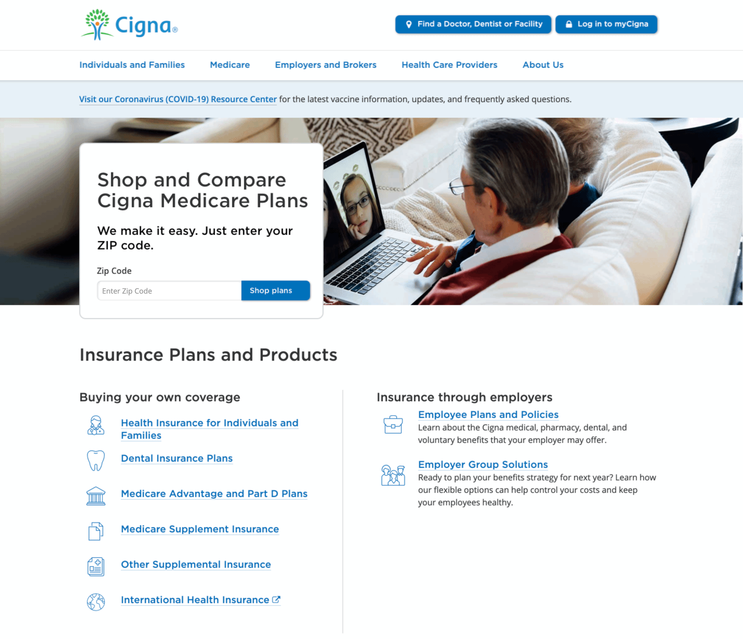
Medicare enrollment on Cigna.com
Redesign of Cigna.com’s digital shopping experience for their Medicare product line
Project Summary
With a recent update to Cigna’s digital brand standards and a dated live Medicare shopping experience, it was mandated from business leadership to have the Medicare shopping experience redesigned to look up to date and function easier and more pleasantly for Medicare shoppers. This project took the majority of my time at Cigna. It encompassed the full user-centered design process. It began with research, internal business analysis, competitor analysis, user testing, design and implementation.
The KPIs
User research from the present experience indicated that the Medicare shopping experience needed to improve in the following KPIs:
SUS (System Usability Scale) 61 in 2018
NPS (Net Promoter Score) 6.5 out of 10 in 2018
Task success rate
Time on task
Total User error rate
My End-to-End Design Process


The Research
The first step that was taken was a user test of the current Cigna.com medicare experience. Research was conducted by a dedicated user research with myself generating the testing assets to identify areas of improvement in the present Cigna.com medicare shopping experience. Watching potential medicare customers in a controlled test online using UserZoom revealed the following take aways:
Users clearly wanted to see the deductible and total annual cost breakdown for the plans they qualified for.
Many wanted an intuitive way to view the plan on a comprehensive benefit level to see a more detailed breakdown.
And it was important for many customers to more easily input what drugs were covered by each plan and to what degree and the placement of that feature was hard to discover in the present design leading to many failed attempts.
Customers want to find a plan and stick with it for life so it’s an important task that customers want to get right the first time. Yet the process was so complex that often customers found the process to be frustrating given the complexity of options and plan details. Several mentioned that they would prefer to do this process over the course of several sessions.
Parts of the shopping experience were outsourced at the time and the experience looked broken and made it harder for users to process what they wanted to do. Customers wanted an experience that looked and felt connected with a single design look and feel.
Additionally research was conducted to review all our major healthcare competitors in the space to see how they enrolled customers into Medicare online. This combined with research on best design practices for the selling complex services and products digitally led to my quest to redesign the Cigna.com Medicare experience.

The Key Design Elements & Flows
I worked with a team of stakeholders that managed the Medicare, Cigna.com as well as UX Design leadership to design and iterate several different shopping experiences that met the newly mandated 2.0 Cigna Digital brand standards. There were several key user flows that comprised of the shopping experience that were key to this redesign:
Plan Cards to easily display key information
Plan cards we designed to display the following key information users were looking for. This included:
The monthly premium
CTAs to enroll or view more details
A list of benefits
Primary Care Copay/Specialist Copay
Links to add drugs to plans to get a better cost estimate
An option to select plans so they could be compared

Cigna Medical Advantage Plan & Medical Supplement Cards

Select Medicare Advantage Plans Page
Prescription Drugs Flow


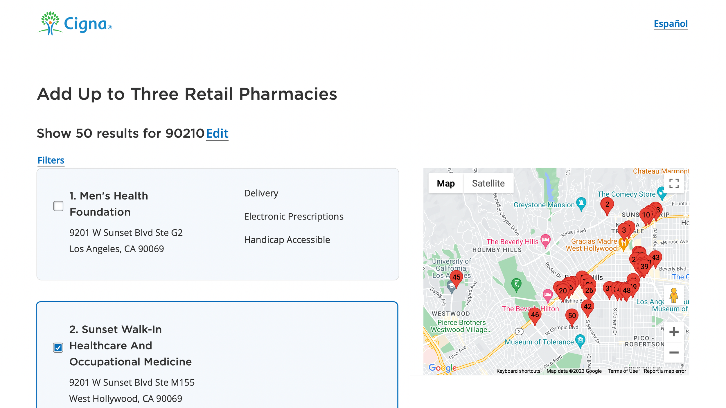
Adding A Pharmacy Flow


Compare Plans

A t the bottom of the plan card, a user can check ‘Compare Plans” and an overlay appears to display a list of plans selected.


Plan Details


Building the Prototype
Once the Medicare shopping experience was fully flushed out in Sketch. The User Testing team had me recreate the entire experience in Axure so that the experience could function much like a live website. The biggest challenge for me that I found interesting and different from most other projects was the level of complexity that was required to reproduce certain behaviors like a flyover comparison tool that has a large variety of plans that can be selected. The prototype was so well received by the testing team that the project then had scope creep and I ended up creating a prototype for the User Testing Team that included the entire Cigna.com website for future testing needs.
The Final Product: Medicare Shopping 2.0
The end result yielded a user research and tested shopping experience that now provides users with easier to use and more intuitive ways to find the the answers to this list of burning questions that users face when comparing and shopping for Medicare plans. I build a linear step-by-step guided approach that would reduce the cognitive load of shoppers by breaking down the plan details comprehensively in more digestible chunks.
The redesigned flow needle on one of the most critical KPIs:
SUS (System Usability Scale) 85 (31% increase from the original experience)
NPS (Net Promoter Score) 8.4 (29% increase)
Task success rate, time on task we improved
The total User error rate was down
Once it was fully developed and went to market in 2019 it experienced a 9% increase in sales from the previous year and a 6% swing in users enrolling online vs over the phone. This resulted in a 117 million dollar increase in revenue attributed to online enrollment in 2019. The shopping flow remains intact to this day with minimal changes from the original design until Cigna sold its medicare division in 2022 for an undisclosed fee (valued at 9 Billion dollars).
Check out: https://plans.cigna.com
Type in your zip code and have a look at medicare options in your area to get a feel for what I accomplished here.
Project Duration
24 Months
Role
Senior User Experience Designer
Tools
UserZoom, Sketch, Axure